Navigation – Default
Atomic Design
Level: Organism · Atomic Design methodology
The default Navigation combines global site identity, search capability, and navigational links into a horizontal header layout optimized for desktop and tablet screens (≥ 1024px).
The Default Navigation variant is the primary desktop header. It displays the full category list horizontally across the menu bar, which opens a multi-column mega-menu on hover. It also exposes the search bar with inline auto-suggestions, and displays utility indicators with real-time badges (for comparison, wishlist, and cart).
For the general composition and the mobile variant, see the Navigation index.
Composition
Used inside: Default Layout · Category Page · Search Page · Product Page
Composed of: Logo · Search Bar · Category Tabs · Wishlist Indicator · Compare Indicator · Account Trigger · Mini Cart Trigger
Preview

Default layout of the desktop header showing navigation categories, search bar, and store tools.
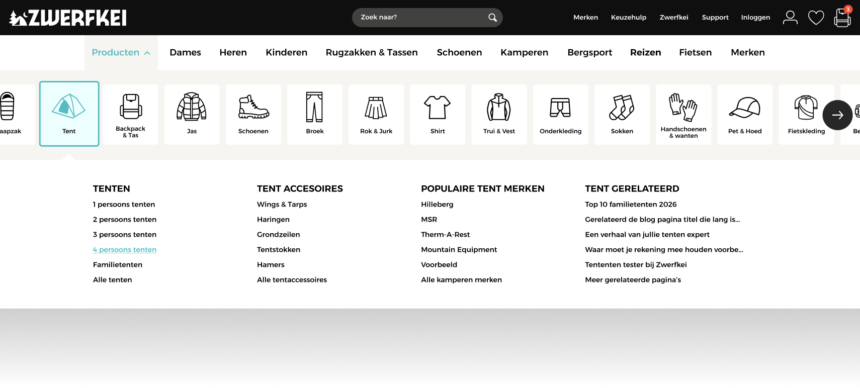
Expanded mega menu display showing hover interaction and product category tree layout.
Props
Top-level props
| Prop | Type | Required | Description |
|---|---|---|---|
categories |
Category[] |
Yes | List of main categories and subcategories used to populate the menu and mega-menu columns |
cartCount |
number |
Yes | Count of items currently in the shopping cart (hides badge if 0) |
wishlistCount |
number |
Yes | Count of items in the wishlist |
compareCount |
number |
Yes | Count of items in comparison list |
isAuthenticated |
boolean |
Yes | Login status of the user; switches account icon action |
userName |
string \| null |
No | Username shown next to the account icon when logged in |
searchQuery |
string |
Yes | Binds the current search term value |
Nested object props
Prop path: categories[]
| Field | Type | Required | Description |
|---|---|---|---|
id |
string |
Yes | Unique category key/slug |
name |
string |
Yes | Display text for the menu tab |
url |
string |
Yes | Destination URL |
active |
boolean |
Yes | Highlight state if the user is currently browsing this category |
featuredImage |
string \| null |
No | Optional promo image url displayed inside the mega-menu dropdown |
featuredUrl |
string \| null |
No | Destination link for the featured image |
children |
SubCategory[] |
No | List of child categories for the mega-menu columns |
Prop path: categories[].children[]
| Field | Type | Required | Description |
|---|---|---|---|
id |
string |
Yes | Unique subcategory key/slug |
name |
string |
Yes | Display text for the column header or link |
url |
string |
Yes | Destination URL |
children |
SubCategory[] |
No | Deeper nested subcategory links (third-level list under column header) |
Visual States
| State | Condition | Visual effect |
|---|---|---|
| Sticky Header | Page scrolled > 60px |
Header container height shrinks slightly, background gains subtle drop shadow, transitions to sticky overlay at viewport top |
| Mega Menu Open | Hovering on a category tab with child categories | Mega-menu panel transitions to visible (opacity 1, transform translate-y 0) below the navigation bar |
| Search Suggestions | searchQuery.length >= 3 |
Droplist panel displaying matches and quick results fades in below the search input |
| Cart Badge Visible | cartCount > 0 |
A green indicator badge with the item count is overlaid on the shopping cart icon |
| Logged In | isAuthenticated: true |
Account icon state changes, displaying userName next to it and unlocking dropdown links (orders, profile, logout) |
Behaviour
Mega Menu Hover Delay
To prevent accidental menu triggers when moving the cursor across the header, a 150ms debounced delay is applied before fading in the mega-menu panel. A 200ms delay is applied when moving the cursor away before the menu collapses.
Smart Auto-suggest Search
The search input triggers suggestion requests to the Algolia search index only after the query length is at least 3 characters. Input triggers are debounced at 250ms to reduce API server requests.
Real-time Indicator Updates
Counts for the shopping cart, comparison list, and wishlist badges are updated instantly in the global store state without requiring full-page reloads.
Example
Full example JSON
{
  "categories": [
    {
      "id": "wandelen",
      "name": "Wandelen",
      "url": "/wandelen",
      "active": true,
      "featuredImage": "/images/navigation/wandelen-promo.jpg",
      "featuredUrl": "/wandelen/aanbiedingen",
      "children": [
        {
          "id": "wandelschoenen",
          "name": "Wandelschoenen",
          "url": "/wandelen/wandelschoenen",
          "children": [
            { "id": "heren", "name": "Heren wandelschoenen", "url": "/wandelen/wandelschoenen/heren" },
            { "id": "dames", "name": "Dames wandelschoenen", "url": "/wandelen/wandelschoenen/dames" }
          ]
        },
        {
          "id": "wandelkleding",
          "name": "Wandelkleding",
          "url": "/wandelen/wandelkleding",
          "children": [
            { "id": "jassen", "name": "Wandeljassen", "url": "/wandelen/wandelkleding/jassen" },
            { "id": "broeken", "name": "Wandelbroeken", "url": "/wandelen/wandelkleding/broeken" }
          ]
        }
      ]
    },
    {
      "id": "kamperen",
      "name": "Kamperen",
      "url": "/kamperen",
      "active": false,
      "children": [
        {
          "id": "tenten",
          "name": "Tenten",
          "url": "/kamperen/tenten"
        }
      ]
    }
  ],
  "cartCount": 3,
  "wishlistCount": 5,
  "compareCount": 0,
  "isAuthenticated": true,
  "userName": "Rajanik",
  "searchQuery": ""
}