Product Listing Overview
Atomic Design
Level: Organism · Atomic Design methodology
The Product Listing Overview organism groups together key listing molecules (Filter Menu, Product Card Grid, Sorting Options, and Pagination) to form the complete functional section of the Product Listing Page (PLP) where users browse, sort, and filter products.
The Product Listing Overview organism is the core interaction block of the Zwerfkei storefront's category and search pages. It provides searchers and shoppers with real-time controls to refine their product search, compare features, and check stock availability. It coordinates the grid of matching products and adapts dynamically between desktop and mobile viewport presentations.
It exists in two main layout variants: a multi-column desktop default layout with a persistent sidebar filter menu, and a collapsed drawer-based mobile layout.
Open Action Items
Technical elaboration required: Product Listing for non-JS / non-waiting crawlers
The Product Listing Overview currently renders its product grid exclusively client-side: results are fetched by Algolia InstantSearch through an asynchronous XHR request, fired from inside a VueJS component only after that component has booted (mounted).
This means the raw HTML response of a category or search page contains no product links at all for:
- Devices or crawlers that do not execute JavaScript.
- Crawlers that execute JavaScript but do not wait for the async Algolia response to resolve before capturing the page (a common constraint for crawl-budget-limited bots).
A technical elaboration still needs to be produced describing how the Zwerfkei PLP will guarantee real, crawlable product links independent of client-side rendering timing — for example via a server-rendered fallback grid with a progressive-enhancement swap, as documented in the reference technique below.
Composition
Used inside: Category Page Template · Search Results Page Template · Special Collection Page Template
Composed of:
- Algolia sidebar filter (Sidebar filter): Refinementlist · Range slider · Size selection? · Color selection? · Clearrefinement
- Algolia Toolbar (Toolbar): Toolbar -> Sortby · Hits per page · Pagination
- Algolia Overview (Overview): Product card [default]
Variants
| Variant | Slug | Where it is used | Distinguishing layout |
|---|---|---|---|
| Default (Desktop) | product-listing-overview-default |
Viewports ≥ 1024px | Multi-column grid: persistent filter sidebar on the left, sorting and pagination controls surrounding a 3-column product grid on the right. |
| Mobile | product-listing-overview-mobile |
Viewports < 1024px | Single-column layout: filter menu collapsed into a slide-out drawer, bottom sticky bar for active filters count and triggers, 2-column product grid. |
Preview
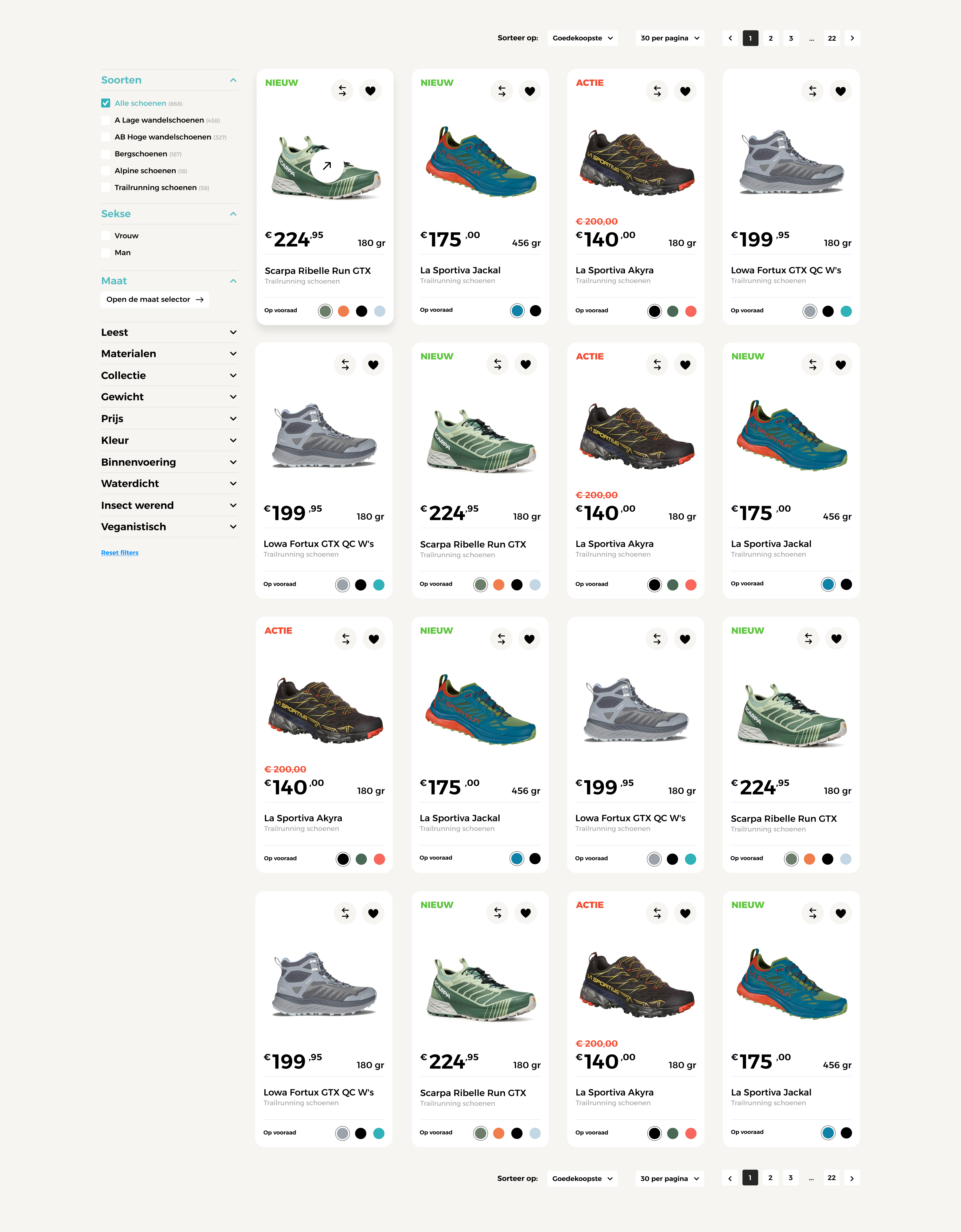
Product Listing Overview on desktop viewports showing persistent filter accordions, active filter tags, sorting bar, product cards, and pagination.
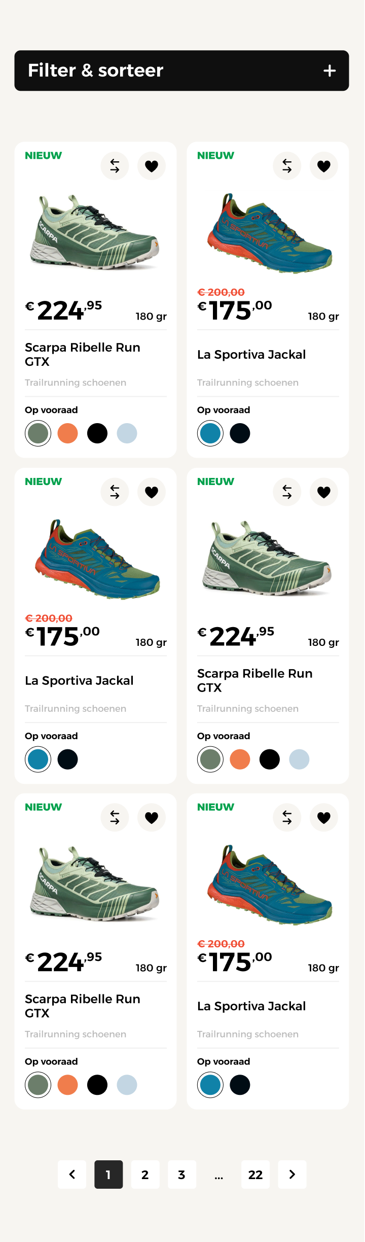
Product Listing Overview on mobile viewports showing a slide-out filter drawer overlay.
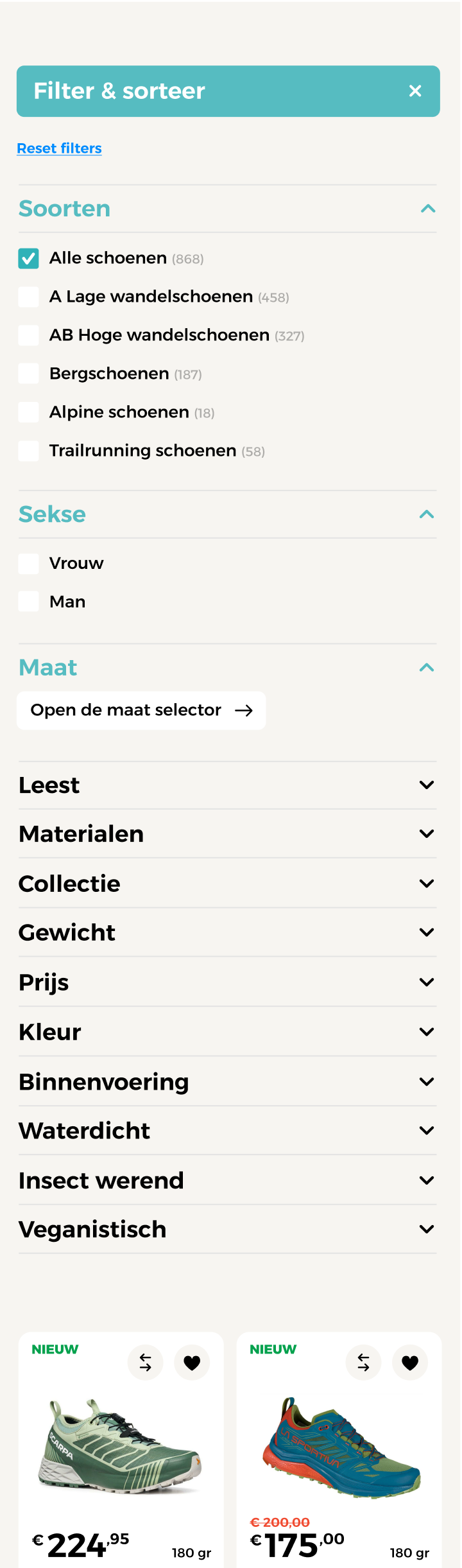
Expanded filter menu details showing checked filter values and subcategory counts.
Atomic breakdown
The Product Listing Overview is a complex organism constructed from blocks, components, and atomic elements mapped in the sitemap:
graph TD
    subgraph Templates["Page Templates"]
        CT[Category Page Template]
        ST[Search Page Template]
    end

    subgraph Organism["Organism"]
        PLP["Product Listing Overview
(default · mobile)"]
    end

    subgraph Blocks["Sitemap Blocks (Algolia)"]
        FIL["Algolia sidebar filter
(Sidebar filter)"]
        TB["Algolia Toolbar
(Toolbar)"]
        PCG["Algolia Overview
(Overview)"]
    end

    subgraph Components["Sitemap Components / Molecules"]
        RL[Filter -> Refinementlist]
        RS[Filter -> Range slider]
        SS[Filter -> Size selection?]
        CS[Filter -> Color selection?]
        CR[Filter -> Clearrefinement]
        SB[Toolbar -> Sortby]
        HP[Hits per page]
        PAG[Pagination]
        PC["Product card [default]"]
    end

    CT --> PLP
    ST --> PLP

    PLP --> FIL
    PLP --> TB
    PLP --> PCG

    FIL --> RL & RS & SS & CS & CR
    TB --> SB & HP & PAG
    PCG --> PC
Breakdown of components within the PLP Overview
| Block | Component / Element | Level | Role | Desktop | Mobile |
|---|---|---|---|---|---|
| Sidebar filter | Refinementlist | Molecule | Checklist filters (e.g. brands, category) | Collapsible | Drawer List |
| Sidebar filter | Range slider | Molecule | Slider selection for price range | Collapsible | Drawer List |
| Sidebar filter | Size selection? | Molecule | Clickable buttons/swatches for sizes | Collapsible | Drawer List |
| Sidebar filter | Color selection? | Molecule | Visual color grids/swatches | Collapsible | Drawer List |
| Sidebar filter | Clearrefinement | Atom | Clears all active filters instantly | Sidebar Top | Drawer Header |
| Toolbar | Toolbar -> Sortby | Molecule | Toggles product sorting (e.g. price low-high) | Top & Bottom | Drawer Trigger |
| Toolbar | Hits per page | Molecule | Toggles count of products per page (e.g. 24, 48) | Top & Bottom | — |
| Toolbar | Pagination | Molecule | Navigates pages of products | Top & Bottom | Bottom Only |
| Overview | Product card [default] | Molecule | Displays individual product details - see Product Card | 3 Columns | 2 Columns |
Connections
Where the Product Listing Overview connects and leads:
- Product Cards: Clicking a product photo or name routes the customer to the Product Detail Page (PDP).
- Filter Options: Clicking checkbox values recalculates the active query, triggers a network request to the backend search API (Ergonode/Algolia), and updates the browser URL parameters.
- Wishlist Action: Toggling the favorite heart icon updates the user's global wishlist state within the Product domain.
- Compare Action: Selecting the compare checkbox adds the product to the global comparison tray.
- Breadcrumbs: The category indicator links back to the higher-level department pages.