Product Card
Atomic Design
Level: Molecule · Atomic Design methodology
The Product Card groups a set of product atoms (image, name, price, badge, stock, actions) into a single reusable unit that represents one product. It carries no layout of its own — it is always placed inside an organism (a slider, a listing grid, the compare view, the cart dialog).
The Product Card is the reusable component that presents a single product across the Zwerfkei storefront. It bundles the product image, name, category, price, an optional badge, stock status, colour variants and inline actions (wishlist, compare, add-to-cart) so that the same product can be rendered consistently wherever it appears.
It exists in two variants — a full-featured default card used in browsing contexts, and a stripped-down compact card used in the cart dialog.
Composition
Used inside (organisms): Product Slider · Product Listing Overview (PLP) · Compare Component · Cart Dialog — see Connections.
Composed of (atoms): Badge · Product Image · Product Name · Category · Price · Old Price · Weight · Stock Indicator · Colour Selector · Wishlist Button · Compare Button · CTA Button — see Atomic breakdown.
Variants
| Variant | Slug | Where it is used | Distinguishing fields |
|---|---|---|---|
| Default | product-card-default |
Product Slider, Product Listing Overview, Compare Component | Full field set: badge, category, weight, stock, colours, wishlist + compare actions |
| Compact | product-card-compact |
Cart Dialog → Related products | Minimal field set: image, name, price (+ old price), add-to-cart |
| --- |
Preview
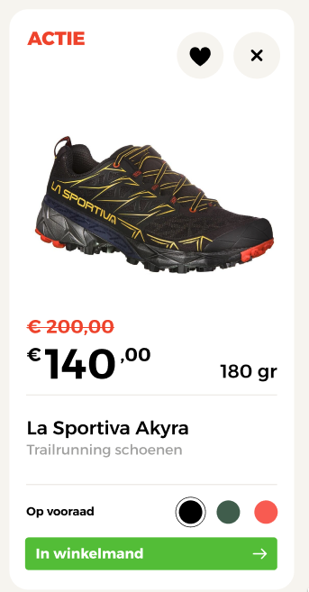
Default variant of the Product Card molecule including image, brand, title, rating, stock status, color options, price, and actions.
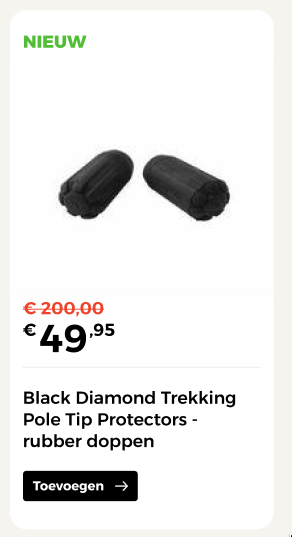
Compact variant of the Product Card molecule optimized for smaller list contexts such as dialogs or trays.
Atomic breakdown
The Product Card is a molecule assembled from atoms drawn from the shared Product atom cluster. Those atoms are reused by other molecules too (e.g. the product detail page), so they are not exclusive to the card.
graph TD
    subgraph Organisms
        SL[Product Slider]
        PLP[Product Listing Overview]
        CMP[Compare Component]
        CD[Cart Dialog]
    end

    subgraph Molecule
        PC["Product Card
(default · compact)"]
    end

    subgraph Atoms["Atoms — shared 'Product' cluster"]
        A1[Badge]
        A2[Product Image]
        A3[Product Name]
        A4[Category]
        A5[Price]
        A6[Old Price]
        A7[Weight]
        A8[Stock Indicator]
        A9[Colour Selector]
        A10[Wishlist Button]
        A11[Compare Button]
        A12[CTA Button]
    end

    SL --> PC
    PLP --> PC
    CMP --> PC
    CD --> PC

    PC --> A1 & A2 & A3 & A4 & A5 & A6 & A7 & A8 & A9 & A10 & A11 & A12
Atoms used by the Product Card
| Atom | Field | Role | Default | Compact |
|---|---|---|---|---|
| Product Image | Image |
Product photo; swaps with the selected colour variant | ✅ | ✅ |
| Product Name | Title |
Product display name; links to the product detail page | ✅ | ✅ |
| Category | Category |
Category label shown beneath the name | ✅ | — |
| Price | Price |
Current selling price | ✅ | ✅ |
| Old Price | Price-previous |
Strikethrough price shown when the product is on sale | ✅ | ✅ |
| Weight | Weight |
A single highlighted spec (e.g. shoe weight in grams) | ✅ | — |
| Badge | Badge |
Overlay label on the image (e.g. Nieuw, Sale) | ✅ | ✅ |
| Stock Indicator | Stock status |
Availability state and label — see Stock & Availability | ✅ | — |
| Colour Selector | Colors |
Swatches for switching colour variants | ✅ | — |
| Wishlist Button | Favorite-button |
Toggles the product in the wishlist | ✅ | — |
| Compare Button | Compare-button |
Toggles the product in the comparison list | ✅ | — |
| CTA Button | Add to cart button |
Adds the product to the cart | ✅ | ✅ |
Legend: ✅ present · — not present.
Data-only fields
URL, Category and Weight appear as fields in the design source. URL is not a visual atom — it is the destination the card (image + name) links to. Category and Weight render as plain text/spec rows rather than interactive atoms.
Connections
Where the Product Card is used, and where it leads:
| Organism / context | Variant used | Notes | Page |
|---|---|---|---|
| Product Slider | Default | Horizontal carousel of recommended/related products | page pending |
| Product Listing Overview (PLP) | Default | Category / search result grid | page pending |
| Compare Component | Default + props | Adds a remove (✕) control and an always-visible add-to-cart button | page pending |
| Cart Dialog → Related products | Compact | "Product toegevoegd aan je winkelmand" dialog. Part of the Cart domain | page pending |
Leads to: clicking the product image or name navigates to the Product Detail Page (PDP). The wishlist and compare actions feed the Product domain (wishlist and comparison features).
Bidirectional links
When the organism pages above are created, replace page pending with working links, and add a Used inside entry pointing back to this Product Card from each organism page.
Usage in Context (Organisms)
The following full-page layouts demonstrate how the Product Card (default and compact variants) is integrated into different parent organisms across the storefront.
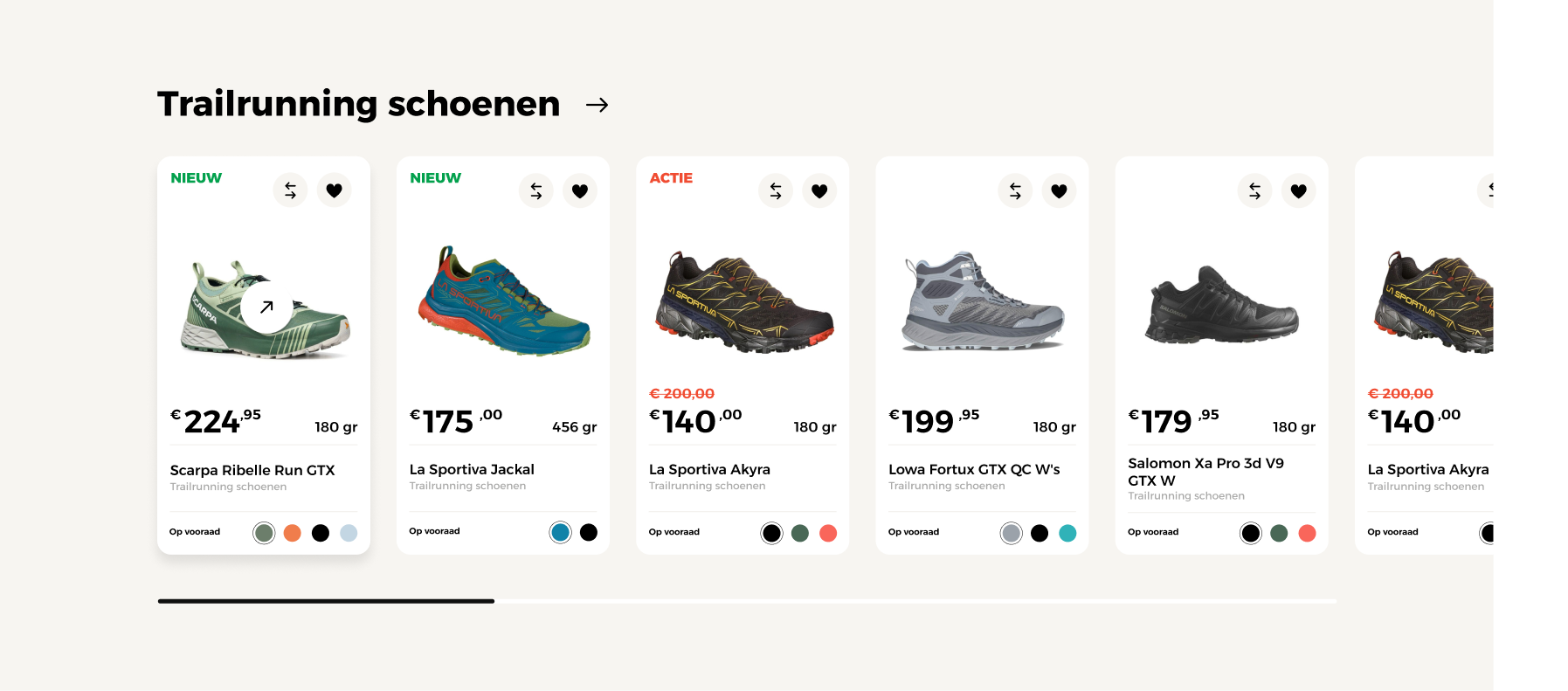
Product Card used inside a horizontal Product Slider carousel with navigation arrows.
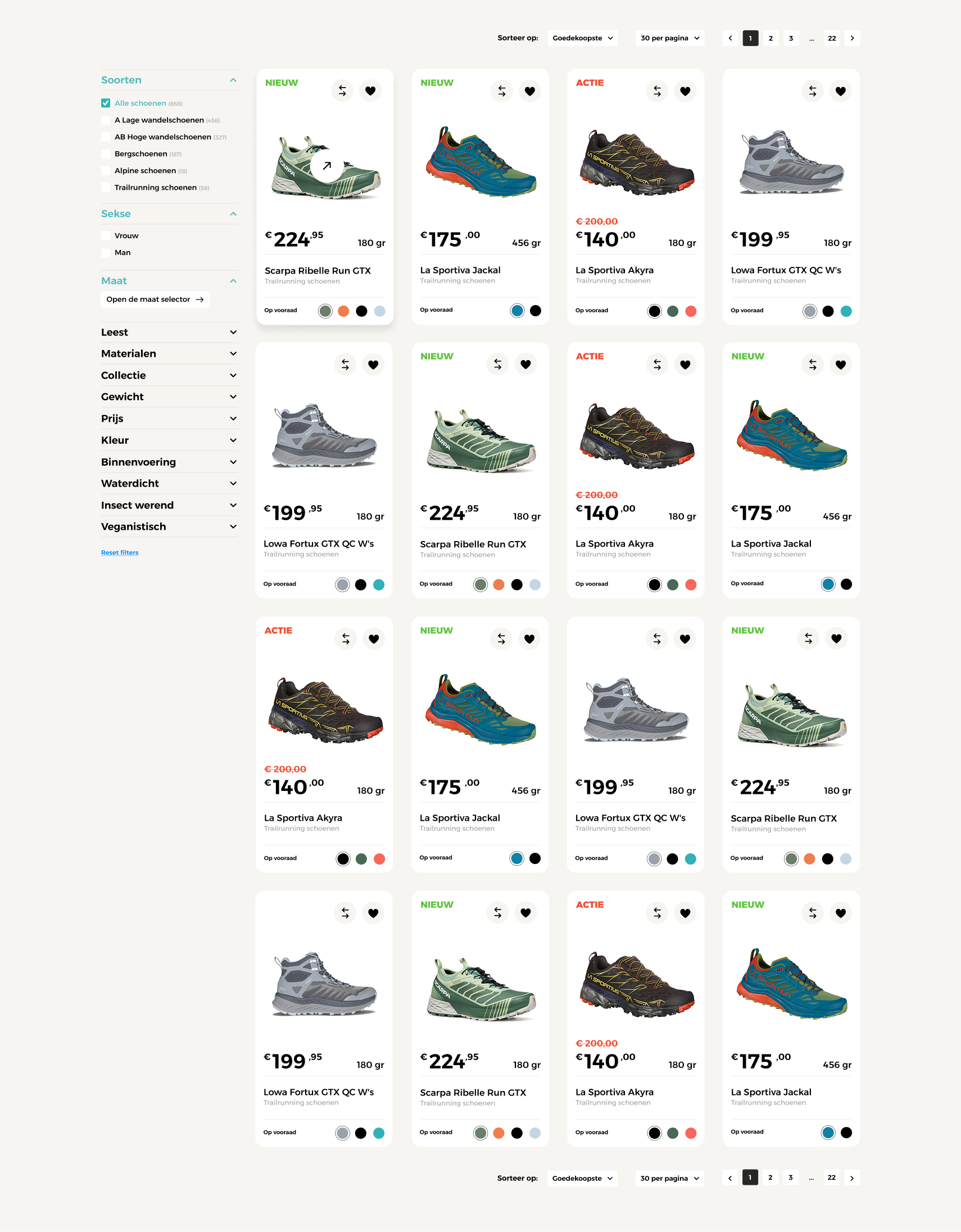
Product Card arranged inside a multi-column responsive grid on the Product Listing Page (PLP).
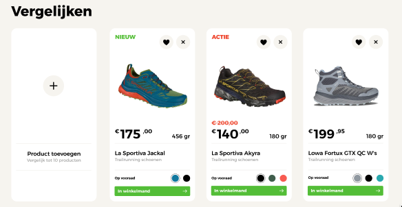
Product Card variants displayed side-by-side inside the compare panel grid.
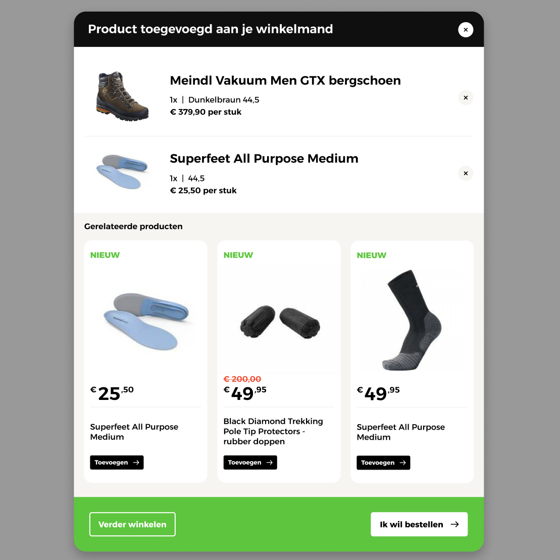
Compact Product Card variant used for cross-selling recommendations in the Cart slide-out dialog panel.