Product Card – Compact
Atomic Design
Level: Molecule · Atomic Design methodology
The compact Product Card is a reduced version of the default molecule, combining only the essential product atoms (image, name, price and add-to-cart) for use in tight, secondary contexts such as the cart dialog.
The Compact Product Card is the stripped-down variant used where space is limited and the goal is a quick add-to-cart rather than full product browsing. It is used in the Cart Dialog ("Product toegevoegd aan je winkelmand") to surface related products.
It drops the category, weight, stock indicator, colour swatches, and the wishlist and compare actions, keeping only the product image, name, price (with an optional old price) and an always-visible add-to-cart button.
For the overview, atomic breakdown and the default variant, see the Product Card index.
Composition
Used inside: Cart Dialog → Related products — part of the Cart domain. See Connections.
Composed of: Product Image · Product Name · Price · Old Price · CTA Button · Badge — see Atomic breakdown.
Preview
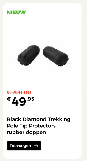
Compact Product Card layout featuring minimal elements (image, name, badge, price, and direct add-to-cart action).
Props
Top-level props
| Prop | Type | Required | Description |
|---|---|---|---|
id |
string |
Yes | Unique product slug used as identifier |
url |
string |
Yes | Destination of the product detail page; the image and name link here |
name |
string |
Yes | Display name of the product |
image |
Image |
Yes | Single product image (no colour-variant switching in compact) |
price |
Price |
Yes | Price data, including an optional sale price (old price) |
badge |
Badge |
No | Optional badge overlaid on the image |
Nested object props
Prop path: image
| Field | Type | Required | Description |
|---|---|---|---|
src |
string |
Yes | Path or URL to the image file |
alt |
string |
Yes | Alt text describing the image for accessibility |
Prop path: price
| Field | Type | Required | Description |
|---|---|---|---|
currency |
string |
Yes | ISO 4217 currency code (e.g. "EUR") |
symbol |
string |
Yes | Currency symbol displayed in the UI (e.g. "€") |
regular |
number |
Yes | Regular (non-discounted) price |
sale |
number |
No | Sale price. When present, the regular price renders as the strikethrough old price |
Prop path: badge
| Field | Type | Required | Description |
|---|---|---|---|
label |
string |
Yes | Text displayed in the badge (e.g. "Nieuw", "Sale") |
visible |
boolean |
Yes | Whether the badge is rendered |
Visual States
| State | Condition | Visual effect |
|---|---|---|
| On sale | price.sale is set |
Sale price shown prominently; regular price rendered as strikethrough old price |
| Badge | badge.visible: true |
A labelled badge is overlaid on the product image |
No stock, colour, wishlist or compare states
Unlike the default variant, the compact card has no stock indicator, colour selector, wishlist or compare controls, so it has none of those visual states. The add-to-cart button is always visible.
Behaviour
Always-visible add-to-cart
The compact card's purpose is a fast re-add to the cart, so the add-to-cart CTA is always rendered — unlike the default card, where the CTA is context-dependent.
Single image, no colour switching
The compact card shows one image and does not expose colour variants. If a product has multiple colours, the compact card represents a single selected one.
Example
Full example JSON
{
  "id": "scarpa-ribelle-run-gtx",
  "url": "/trailrunning-schoenen/scarpa-ribelle-run-gtx",
  "name": "Scarpa Ribelle Run GTX",
  "image": {
    "src": "/images/scarpa-ribelle-run-gtx-forest-green-1.jpg",
    "alt": "Scarpa Ribelle Run GTX – Forest Green"
  },
  "price": {
    "currency": "EUR",
    "symbol": "€",
    "regular": 249.95,
    "sale": 224.95
  },
  "badge": {
    "label": "Sale",
    "visible": true
  }
}