Navigation – Mobile
Atomic Design
Level: Organism · Atomic Design methodology
The mobile Navigation collapses global category listings, utilities, and search overlays into a single layout optimized for viewport widths < 1024px.
The Mobile Navigation variant is used on smaller viewports. It features a compact header bar with a logo, search trigger, cart trigger, and a hamburger menu icon. Toggling the hamburger icon opens a full-height slide-out drawer displaying a collapsible category tree, wishlist/compare links, and user account shortcuts.
For the general composition and the default desktop variant, see the Navigation index.
Composition
Used inside: Default Layout · Category Page · Search Page · Product Page
Composed of: Hamburger Toggle · Logo · Search Icon Trigger · Mini Cart Trigger · Collapsible Category Accordion · Drawer Overlay
Preview
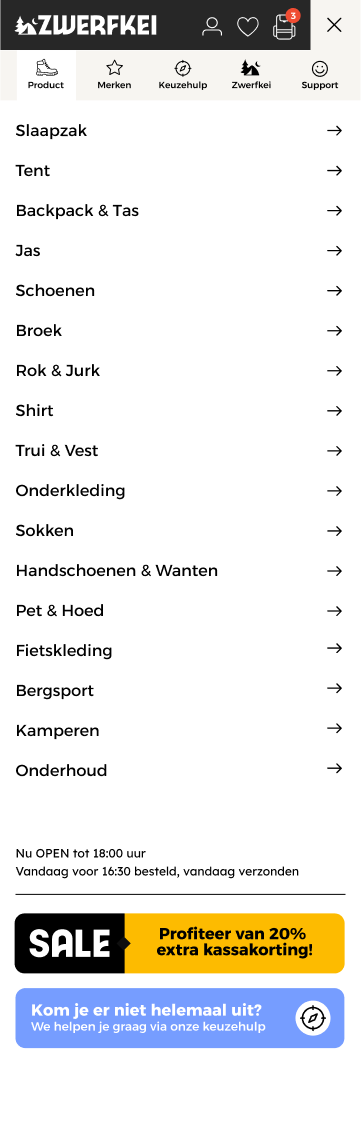
Mobile navigation drawer expanded with account utilities, search trigger, and category links.
Props
Top-level props
| Prop | Type | Required | Description |
|---|---|---|---|
categories |
Category[] |
Yes | List of categories and subcategories used to populate the collapsible accordion menu |
cartCount |
number |
Yes | Count of items currently in the shopping cart (drives badge count) |
wishlistCount |
number |
Yes | Count of items in the wishlist |
compareCount |
number |
Yes | Count of items in comparison list |
drawerOpen |
boolean |
Yes | Controls whether the slide-out navigation menu is visible |
searchActive |
boolean |
Yes | Controls the visibility of the mobile full-screen search input overlay |
activeAccordionIds |
string[] |
Yes | Array of category IDs that are currently expanded in the accordion list |
Visual States
| State | Condition | Visual effect |
|---|---|---|
| Header Sticky | Page scrolled > 50px |
Mobile top bar shrinks slightly and sticks to the top of the viewport |
| Drawer Open | drawerOpen: true |
Left-hand navigation drawer slides in (transform translateX 0%), and a dark semi-transparent overlay fades in over the page background |
| Search Overlay Active | searchActive: true |
Full-screen search input fades in (with active input focus) over the entire viewport |
| Category Expanded | Category ID is present in activeAccordionIds |
Accordion panel slides down to reveal nested subcategory links; toggle arrow rotates 180° |
| Cart Badge Visible | cartCount > 0 |
A green indicator badge with the item count is overlaid on the shopping cart icon |
Behaviour
Page Scroll Locking
When drawerOpen or searchActive is set to true, the body element style is set to overflow: hidden to lock background page scrolling. Scroll lock is removed when closed.
Accordion Nested Toggling
Clicking a parent category tab toggles its visibility by adding or removing its ID from the activeAccordionIds array. Multiple categories can be open simultaneously.
Click Outside to Close
Clicking or tapping on the dark background overlay outside the drawer sets drawerOpen to false, sliding the drawer out of view.
Example
Full example JSON
{
  "categories": [
    {
      "id": "wandelen",
      "name": "Wandelen",
      "url": "/wandelen",
      "active": true,
      "children": [
        {
          "id": "wandelschoenen",
          "name": "Wandelschoenen",
          "url": "/wandelen/wandelschoenen",
          "children": [
            { "id": "heren", "name": "Heren wandelschoenen", "url": "/wandelen/wandelschoenen/heren" },
            { "id": "dames", "name": "Dames wandelschoenen", "url": "/wandelen/wandelschoenen/dames" }
          ]
        }
      ]
    },
    {
      "id": "kamperen",
      "name": "Kamperen",
      "url": "/kamperen",
      "active": false,
      "children": []
    }
  ],
  "cartCount": 0,
  "wishlistCount": 2,
  "compareCount": 1,
  "drawerOpen": true,
  "searchActive": false,
  "activeAccordionIds": ["wandelen"]
}