Product Card – Default
Atomic Design
Level: Molecule · Atomic Design methodology
The default Product Card combines product atoms (image, name, price, badge, stock, colour swatches and actions) into one reusable unit, placed inside listing organisms such as the Product Slider, the Product Listing Overview and the Compare Component.
The Default Product Card is the full-featured variant used in browsing contexts. It shows the product image (switching per colour variant), the product name and category, an optional badge, the price (with an optional strikethrough sale price), a highlighted spec such as weight, stock status, colour swatches, and the wishlist and compare actions.
For the overview, atomic breakdown and the compact variant, see the Product Card index.
Composition
Used inside: Product Slider · Product Listing Overview (PLP) · Compare Component — see Connections.
Composed of: Badge · Product Image · Product Name · Category · Price · Old Price · Weight · Stock Indicator · Colour Selector · Wishlist Button · Compare Button · CTA Button — see Atomic breakdown.
Preview
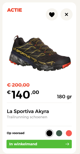
Default layout of the Product Card showing full detail specs, ratings, wishlist toggle, and color swatches.
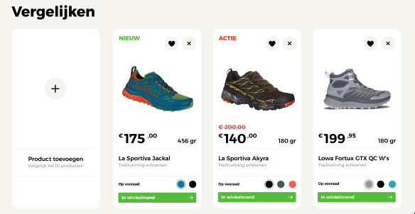
Product Card layout configured for comparing products, showing a top remove control and explicit add-to-cart CTA.
Props
Top-level props
| Prop | Type | Required | Description |
|---|---|---|---|
id |
string |
Yes | Unique product slug used as identifier |
url |
string |
Yes | Destination of the product detail page; the image and name link here |
name |
string |
Yes | Display name of the product |
category |
string |
No | Category label shown beneath the product name |
inWishlist |
boolean |
Yes | Whether the active variant is saved to the wishlist |
inCompare |
boolean |
Yes | Whether the active variant is added to the comparison list |
badge |
Badge |
No | Optional badge overlaid on the product image |
price |
Price |
Yes | Price data, including an optional sale price (old price) |
spec |
Spec |
No | A single highlighted specification (e.g. weight) |
stock |
Stock |
Yes | Stock availability status |
variants |
Variant[] |
Yes | Colour variants, each with its own images and state |
showAddToCart |
boolean |
No | Whether the add-to-cart CTA is rendered |
removable |
boolean |
No | Renders a remove (✕) control. Enabled in the Compare Component |
Nested object props
Prop path: badge
| Field | Type | Required | Description |
|---|---|---|---|
label |
string |
Yes | Text displayed in the badge (e.g. "Nieuw", "Sale") |
visible |
boolean |
Yes | Whether the badge is rendered |
Prop path: price
| Field | Type | Required | Description |
|---|---|---|---|
currency |
string |
Yes | ISO 4217 currency code (e.g. "EUR") |
symbol |
string |
Yes | Currency symbol displayed in the UI (e.g. "€") |
regular |
number |
Yes | Regular (non-discounted) price |
sale |
number |
No | Sale price. When present, the regular price renders as the strikethrough old price |
Prop path: spec
| Field | Type | Required | Description |
|---|---|---|---|
type |
string |
Yes | Spec category key used to resolve a default icon (e.g. "weight") |
value |
number |
Yes | Numeric value of the spec |
unit |
string |
Yes | Unit label appended to the value (e.g. "gr", "mm") |
icon |
string \| null |
No | Override icon name. When null, the icon is resolved from type |
Prop path: stock
| Field | Type | Required | Description |
|---|---|---|---|
available |
boolean |
Yes | Whether the product is currently in stock |
label |
string |
Yes | Human-readable stock status label (e.g. "Op voorraad") |
colorState |
string |
No | Colour state token for the indicator (e.g. "state-green"). See Stock & Availability |
Prop path: variants[]
| Field | Type | Required | Description |
|---|---|---|---|
id |
string |
Yes | Unique identifier for this colour variant |
color |
string |
Yes | Hex colour value used to render the swatch (e.g. "#4A7C59") |
label |
string |
Yes | Human-readable colour name (e.g. "Forest Green") |
active |
boolean |
Yes | Whether this variant is selected. Exactly one variant should be true |
inWishlist |
boolean |
Yes | Whether this variant is saved to the wishlist |
inCompare |
boolean |
Yes | Whether this variant is added to the comparison list |
images |
Image[] |
Yes | One or more product images for this variant |
Prop path: variants[].images[]
| Field | Type | Required | Description |
|---|---|---|---|
src |
string |
Yes | Path or URL to the image file |
alt |
string |
Yes | Alt text describing the image for accessibility |
Visual States
The component adapts its appearance based on the prop values received.
| State | Condition | Visual effect |
|---|---|---|
| Badge | badge.visible: true |
A labelled badge is overlaid on the product image |
| On sale | price.sale is set |
Sale price shown prominently; regular price rendered as strikethrough old price |
| In wishlist | inWishlist: true (active variant) |
Heart icon rendered as filled/active |
| In compare | inCompare: true (active variant) |
Compare icon rendered as active |
| Out of stock | stock.available: false |
Stock label reflects unavailability (e.g. greyed out or warning colour) |
| Active variant | variants[n].active: true |
The selected swatch is highlighted; that variant's images are displayed |
| Add-to-cart shown | showAddToCart: true |
The CTA button is rendered |
| Removable (compare) | removable: true |
A remove (✕) control is shown; the Compare Component also forces the CTA visible |
Behaviour
Wishlist and compare state is per variant
The inWishlist and inCompare fields exist on both the top-level product and on each individual variant. The top-level values reflect the state of the currently active variant and drive the UI icons. Switching colour updates the top-level values to match that variant's state.
Colour swatch selection
Clicking a colour swatch sets that variant's active flag to true and all others to false, triggering an image swap to show the selected variant's product images.
Spec icon fallback
When spec.icon is null, the component resolves an icon from spec.type (e.g. "weight" → a scale icon). An explicit spec.icon value overrides this fallback.
Context-driven actions
The same default card adapts per organism: the add-to-cart CTA and the remove (✕) control are toggled through props (showAddToCart, removable). The Compare Component enables both; listing contexts use the card without them.
Example
Full example JSON
{
  "id": "scarpa-ribelle-run-gtx",
  "url": "/trailrunning-schoenen/scarpa-ribelle-run-gtx",
  "badge": {
    "label": "Nieuw",
    "visible": true
  },
  "name": "Scarpa Ribelle Run GTX",
  "category": "Trailrunning schoenen",
  "inWishlist": true,
  "inCompare": false,
  "price": {
    "currency": "EUR",
    "symbol": "€",
    "regular": 249.95,
    "sale": 224.95
  },
  "spec": {
    "type": "weight",
    "value": 180,
    "unit": "gr",
    "icon": null
  },
  "stock": {
    "available": true,
    "label": "Op voorraad",
    "colorState": "state-green"
  },
  "showAddToCart": false,
  "removable": false,
  "variants": [
    {
      "id": "forest-green",
      "color": "#4A7C59",
      "label": "Forest Green",
      "active": true,
      "inWishlist": true,
      "inCompare": false,
      "images": [
        {
          "src": "/images/scarpa-ribelle-run-gtx-forest-green-1.jpg",
          "alt": "Scarpa Ribelle Run GTX – Forest Green"
        }
      ]
    },
    {
      "id": "orange",
      "color": "#E8673A",
      "label": "Orange",
      "active": false,
      "inWishlist": false,
      "inCompare": false,
      "images": [
        {
          "src": "/images/scarpa-ribelle-run-gtx-orange-1.jpg",
          "alt": "Scarpa Ribelle Run GTX – Orange"
        }
      ]
    }
  ]
}